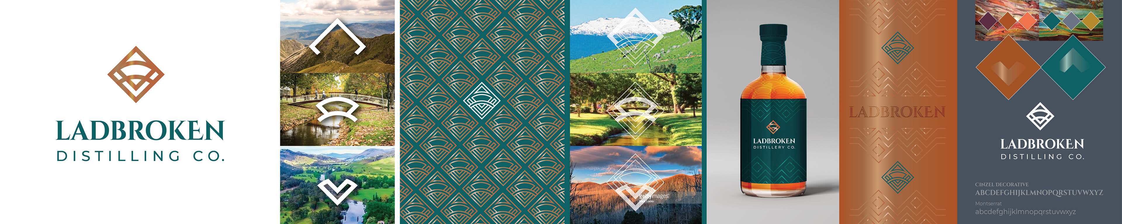
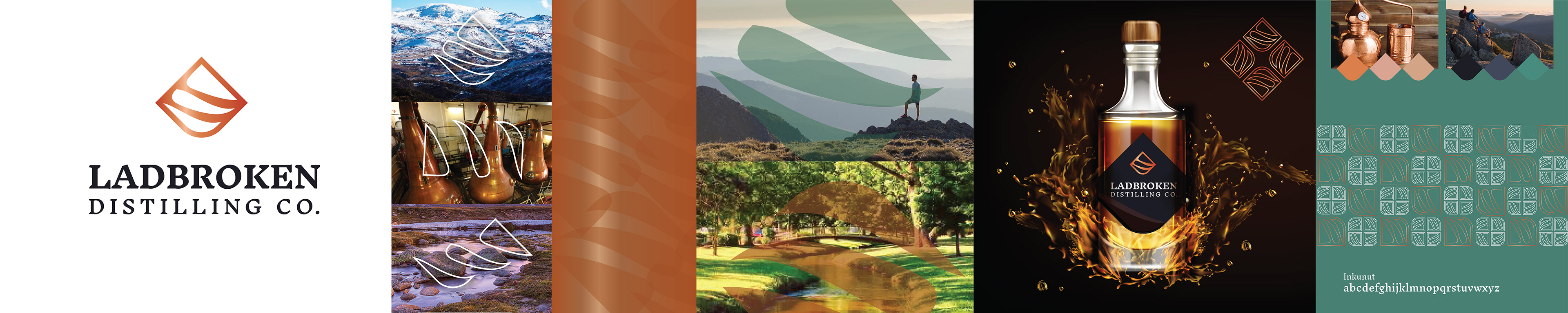
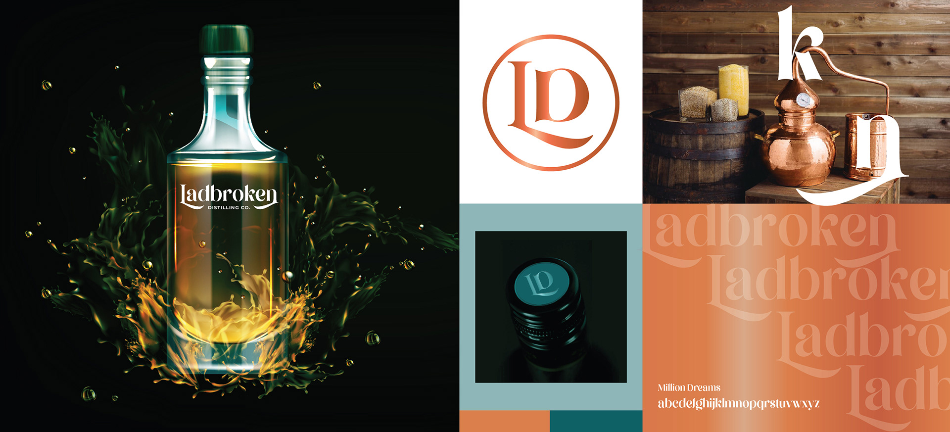
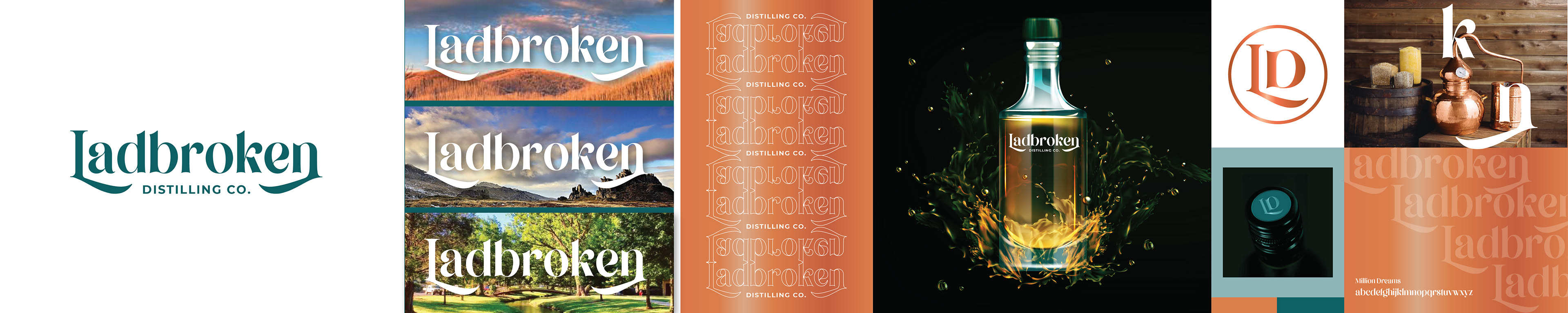
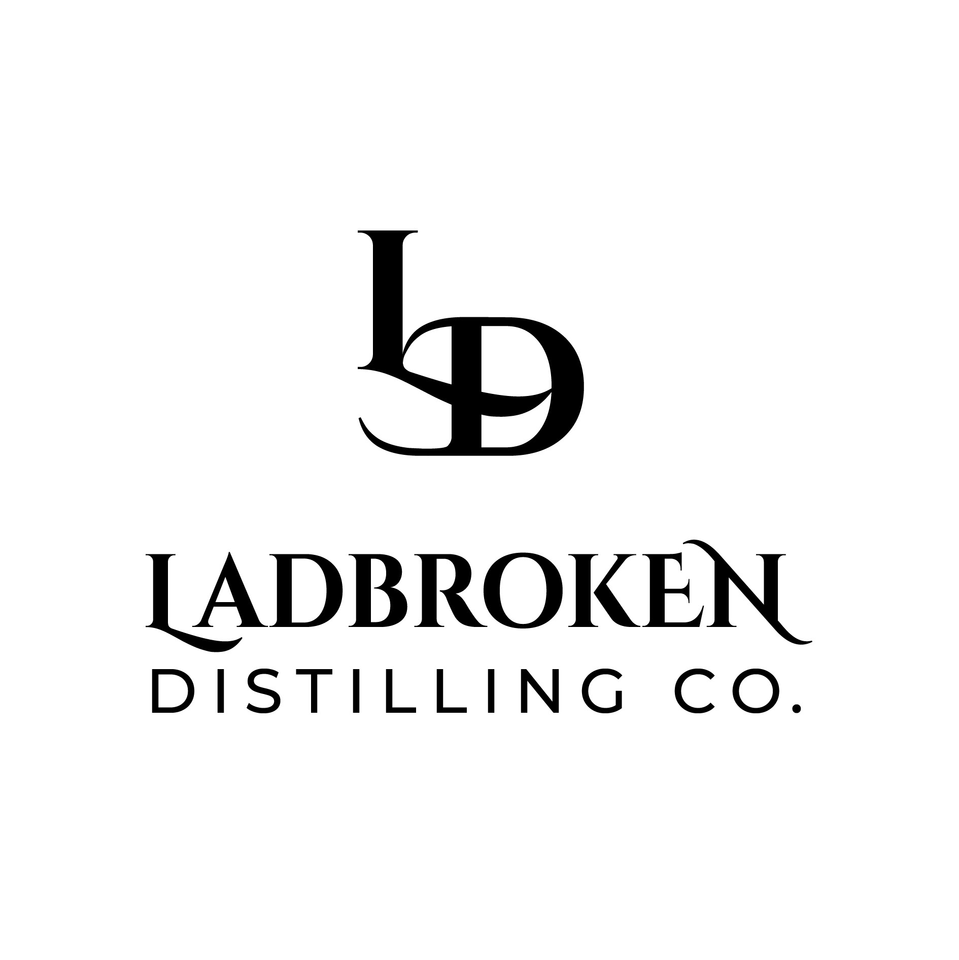
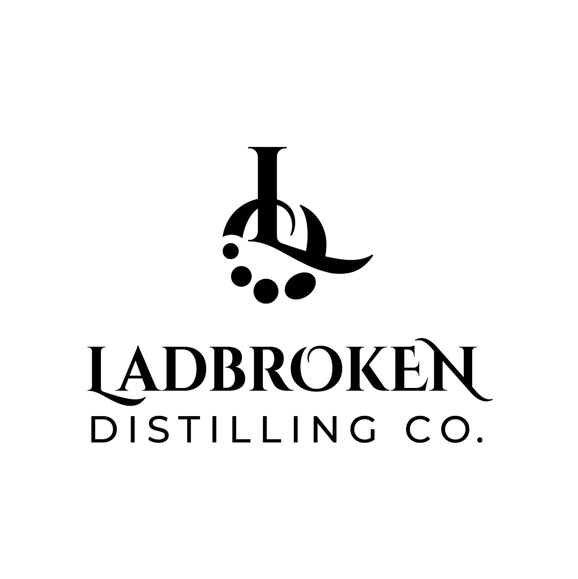
CONCEPT 1
This symbol is Inspired by the combination of snowy mountains and surrounding valleys - A place known for adventure and outdoor recreation, where adventures and relaxation can take place.
Divided with the iconic bridge of Tumbdurumba, this symbol represents the allure of the region and the centre of the artesian community
The icon is deliberately reminiscent of the deco style allowing the brand to be versatile with pattern and shape whilst adopting the elements of luxe and decadence of the period. These shapes would be simple and strong enough to hold intricate illustrations of botanicals as an umbrella brand.
Mountain - Bridge - Valley
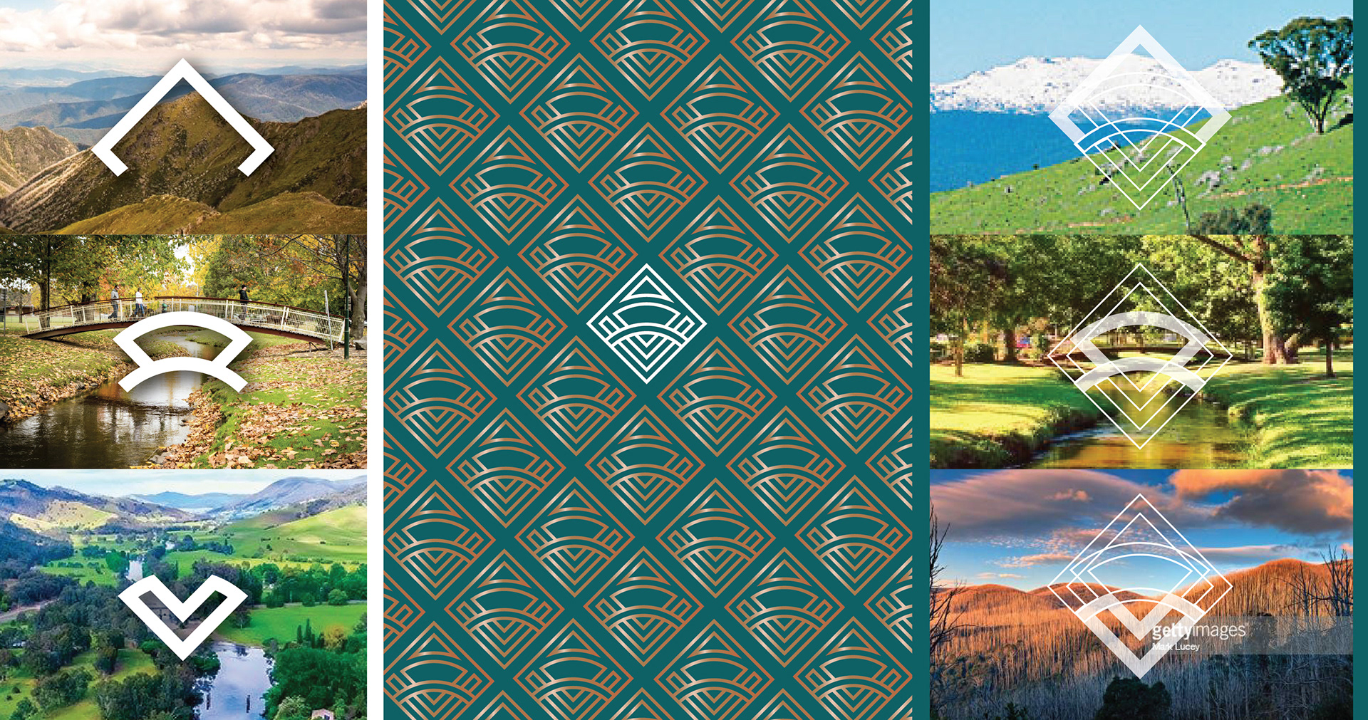
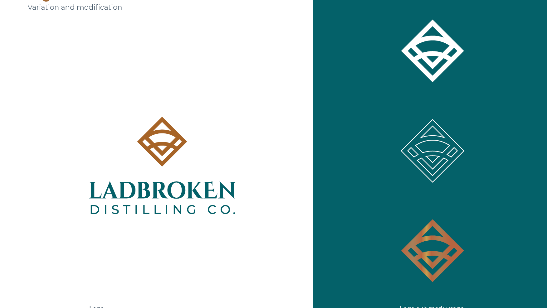
The logo can be detached to form a logo mark on it's own, deconstructed for secondary elements and symbolism. It can be solid or outline to be bold and strong or more intricate and luxurious.
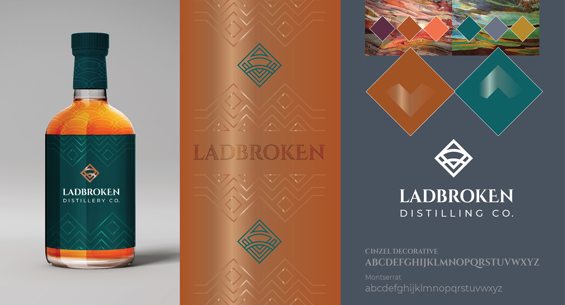
The colours are taken form the natural landscape and matched with the bronze of the process.
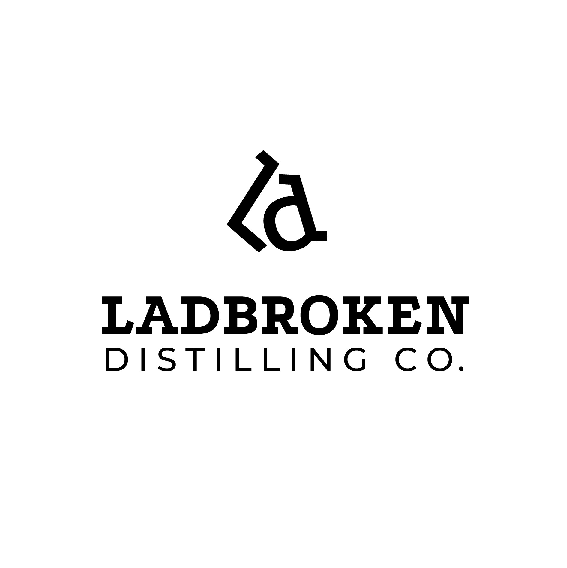
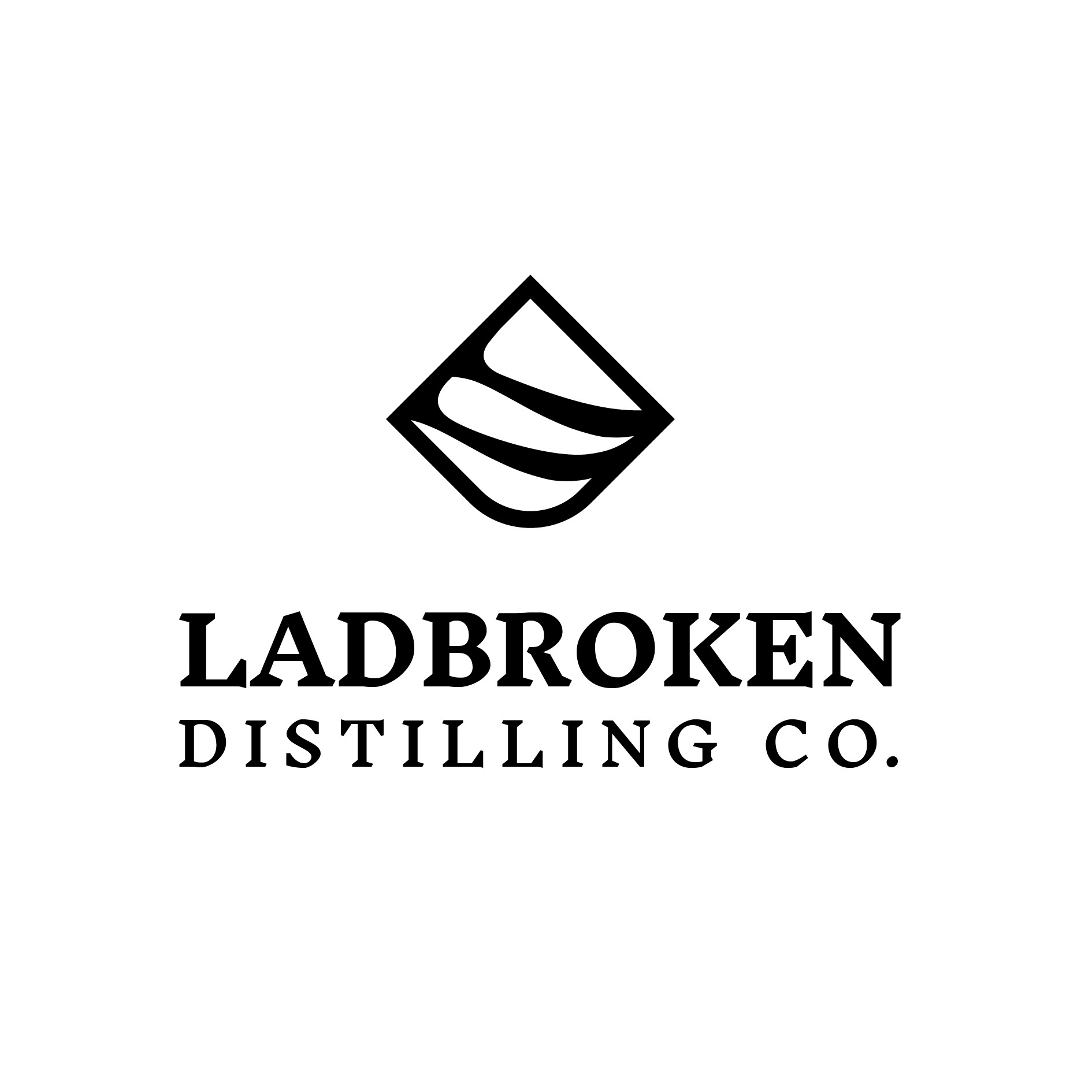
CONCEPT 2
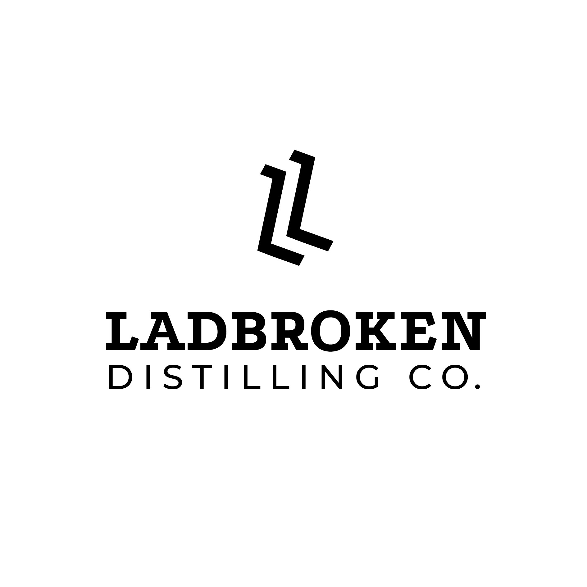
This symbol is Inspired by steps and processes used by Ladbroken Distillery - The individual stepping stones and structured process. Soft shapes reflect stepping stones, liquid, layers organic forms.
The shapes can also be seen as a subtle reference to the letter L.
The holding device is a shape made up of mountain and valley to reflect the surrounding landscape
The Symbol can be arranged and manipulated to form patterns and textures inspired by the art nouveau and art deco periods. These shapes would be simple and strong enough to hold intricate illustrations of botanicals individually or separately as an umbrella brand.
The organic stepping stones not only show process, pathway, balance but also can be seen to mirror the undulations of the snowy valley landscapes
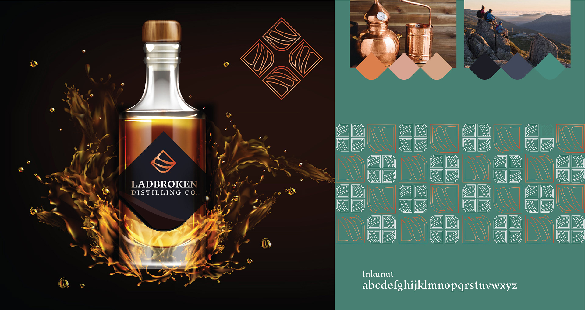
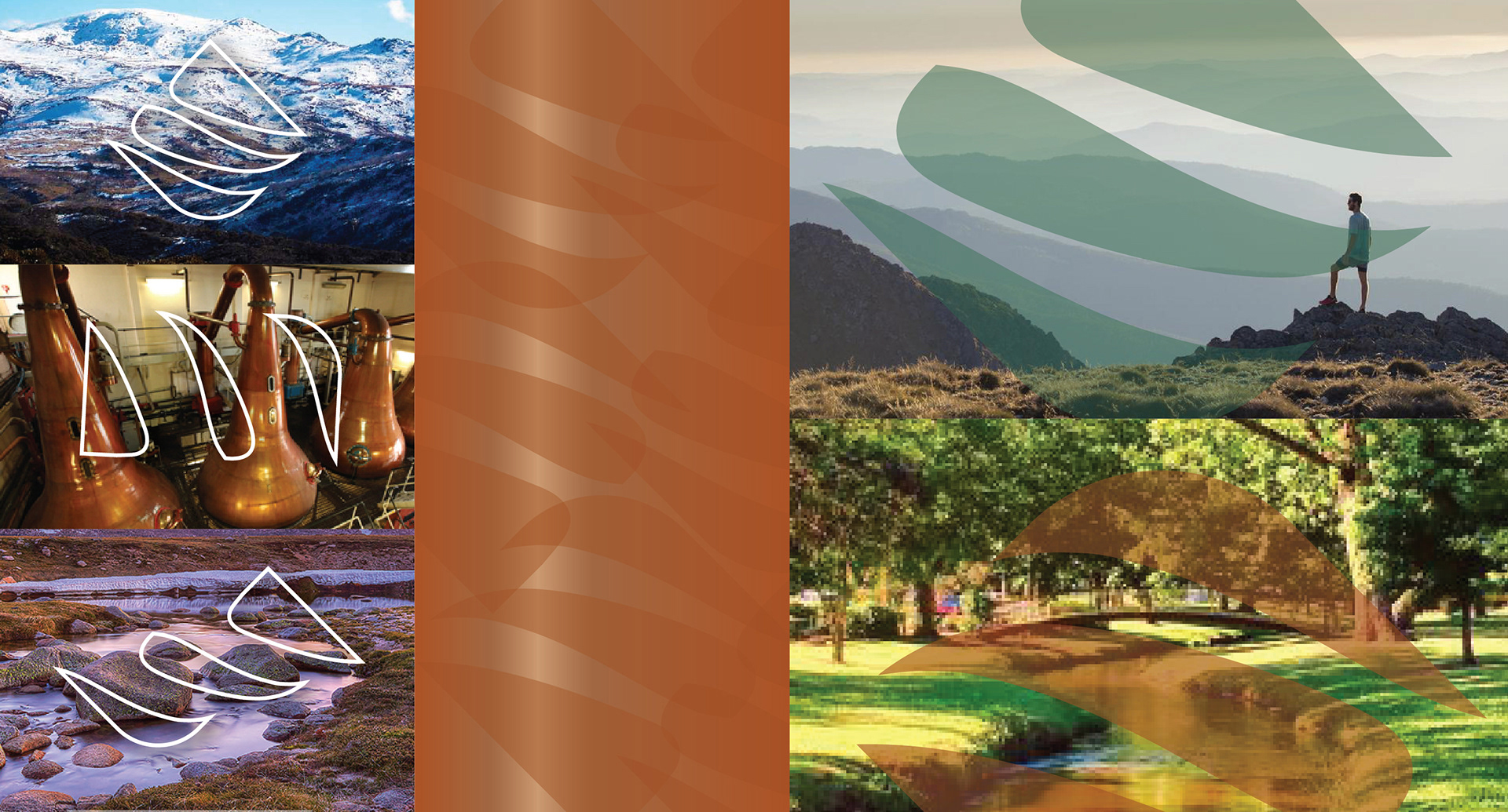
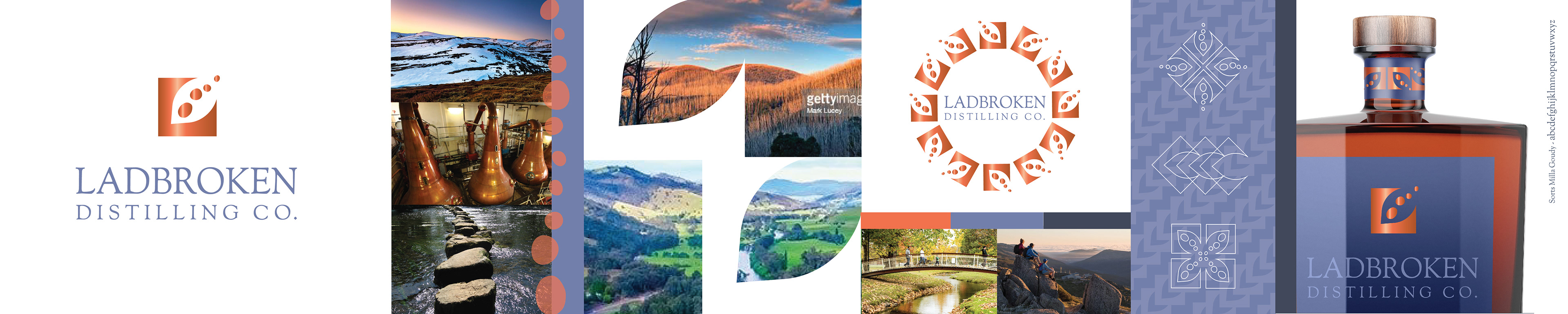
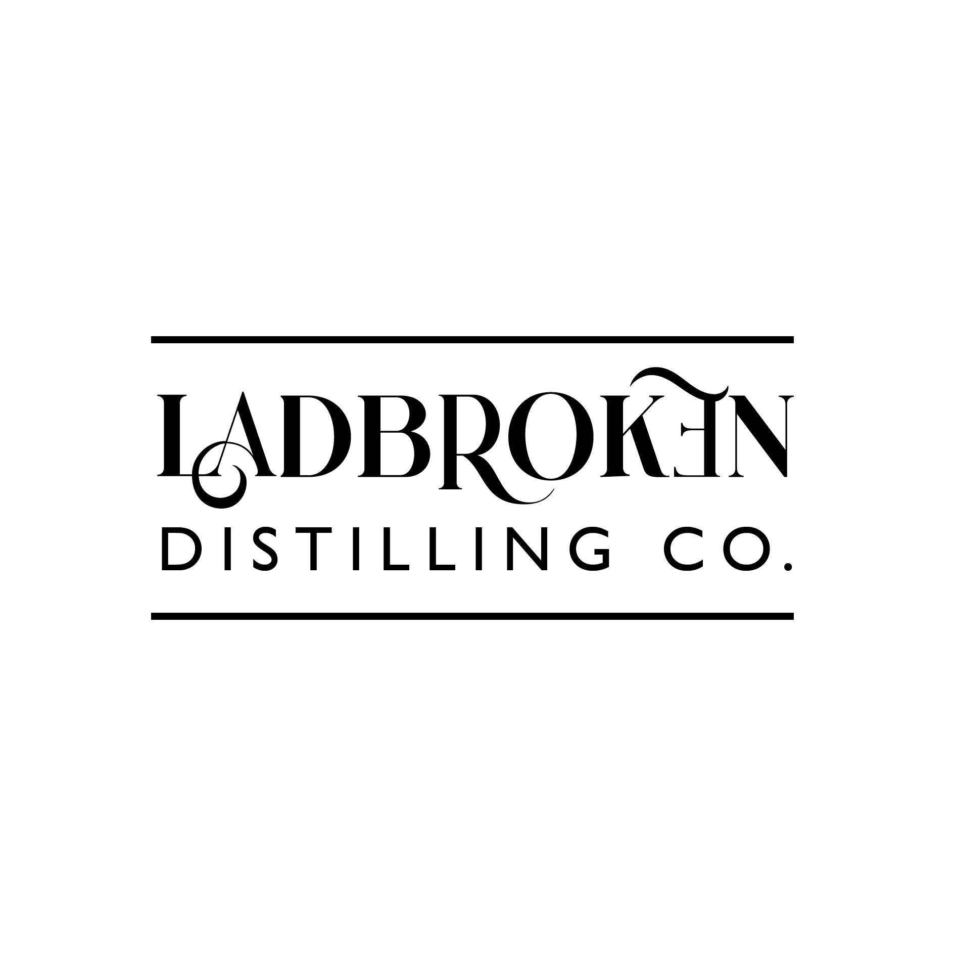
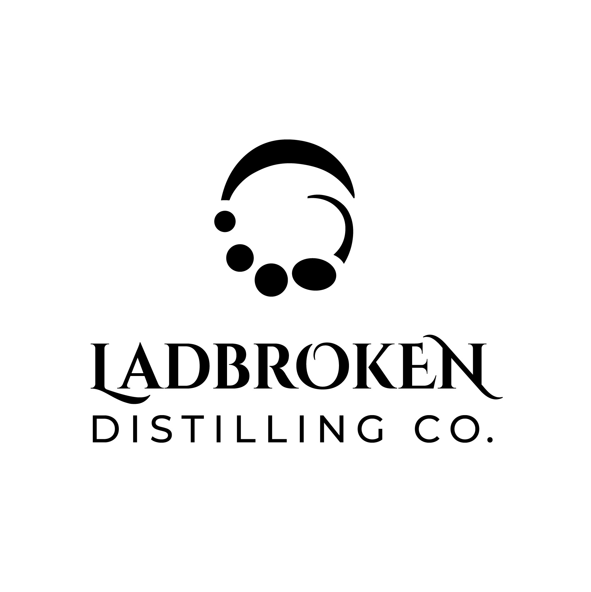
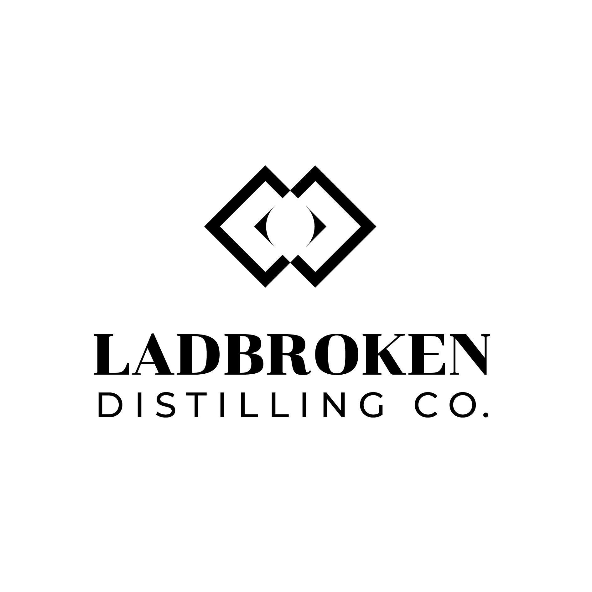
CONCEPT 3
This symbol is representative of the letter L
The void can be identified as a leaf, a seed, a fruit along with seed or segments that imply detail and process. Each element is not quite round and not the same size which helps us visualise organic and unique.
They also represent the unique distilling process and the steps involved.
These shapes are so simple they form the perfect umbrella identity. Strong enough to sit in a corner or become part of the design layout itself. Elements can become holding devices for imagery or texture and act as navigation design inviting the viewer or customer to follow the organic path with their eyes on websites, or their physical self in interior layouts.
This colours are taken from the Tumbdurumba promotional imagery, Softer than previous designs drawing from the dark greys and blue tones in the hillscapes around. The evening light in the last hour of the adventurous day invites a well deserved indulgence.
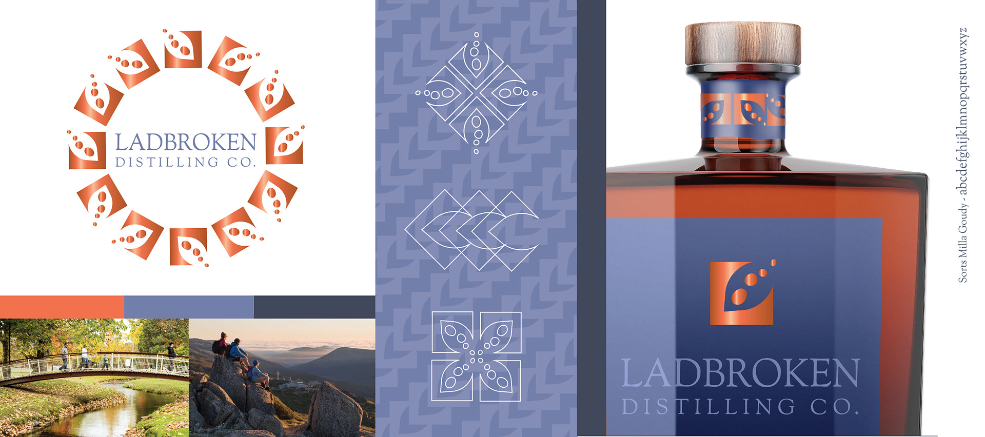
Simple and strong on it's own - the symbol takes on an intricate more detailed feel when repeated.
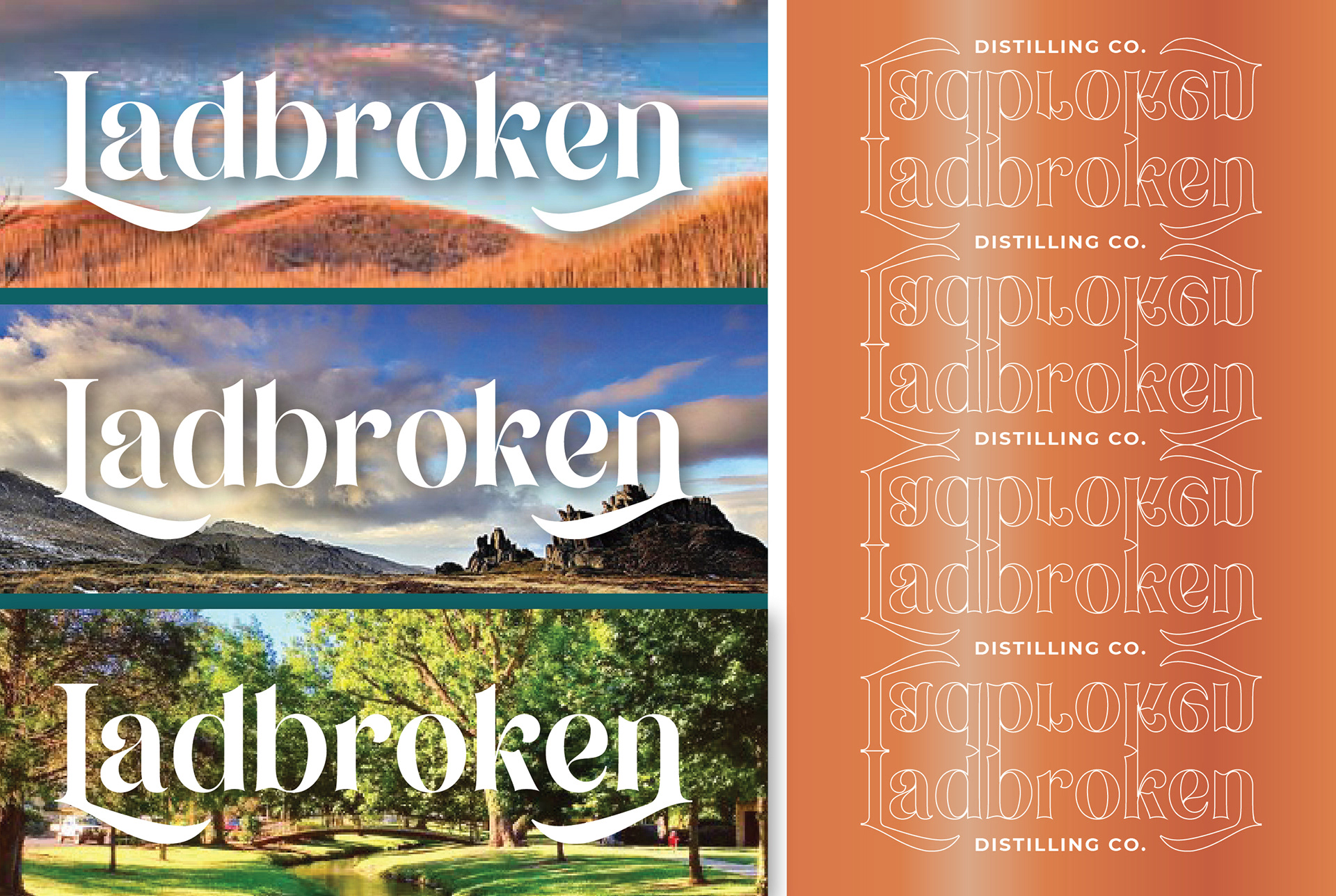
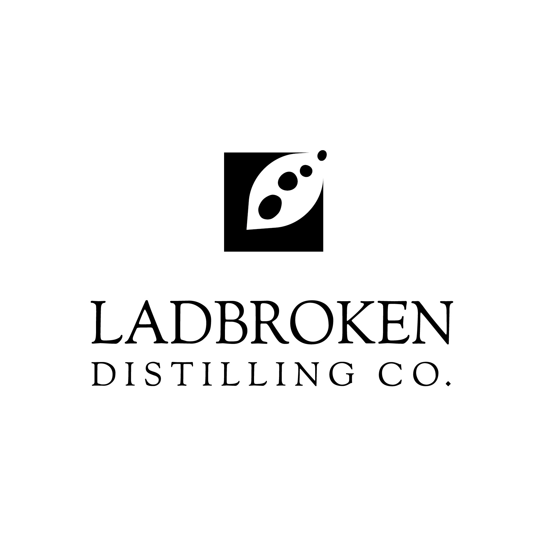
CONCEPT 4
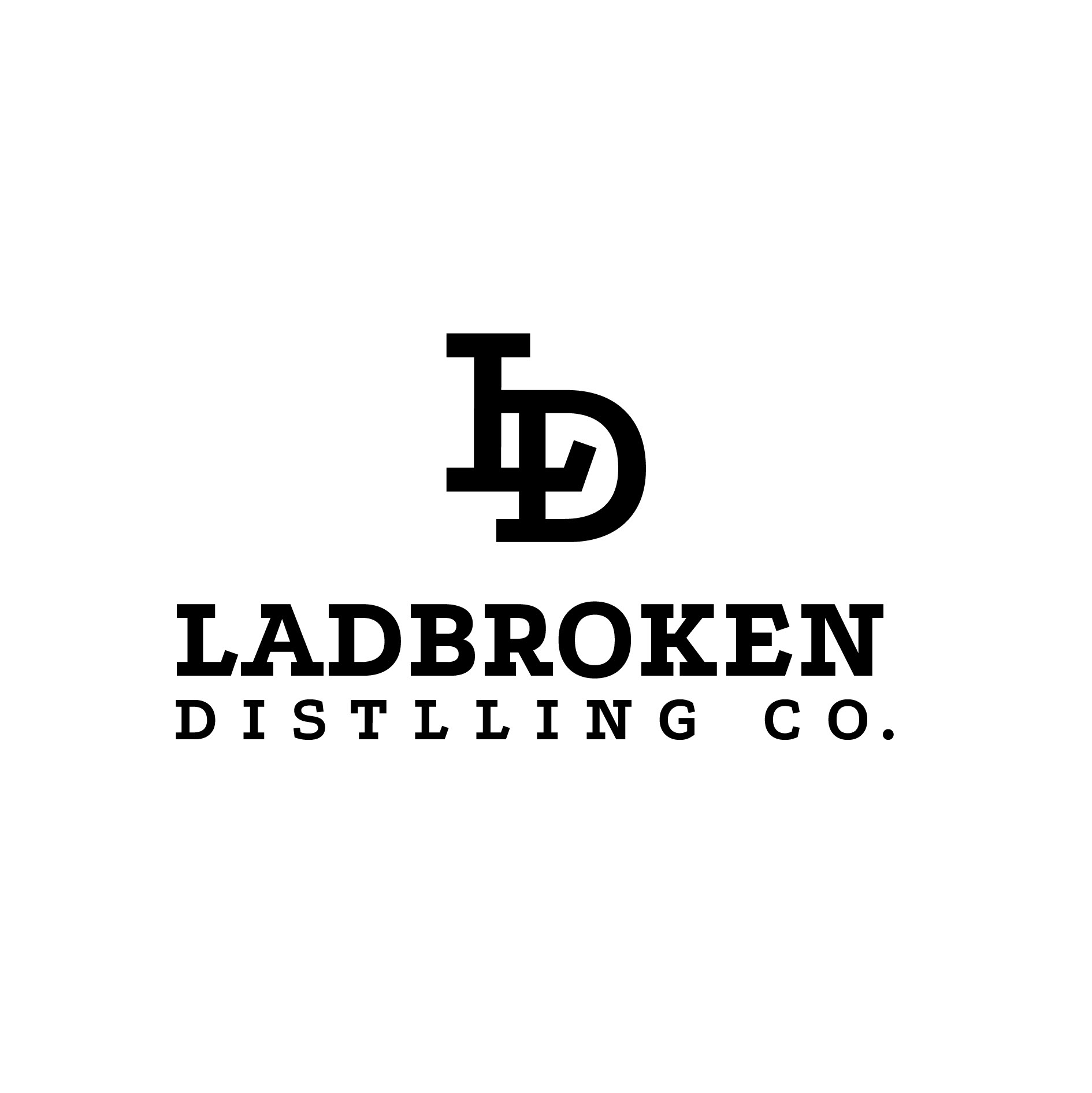
This solution is a type based identity. Designed to be a masthead for the distillery. The typeface has qualities of classic establishment whilst maintaining rounded organic letterforms.
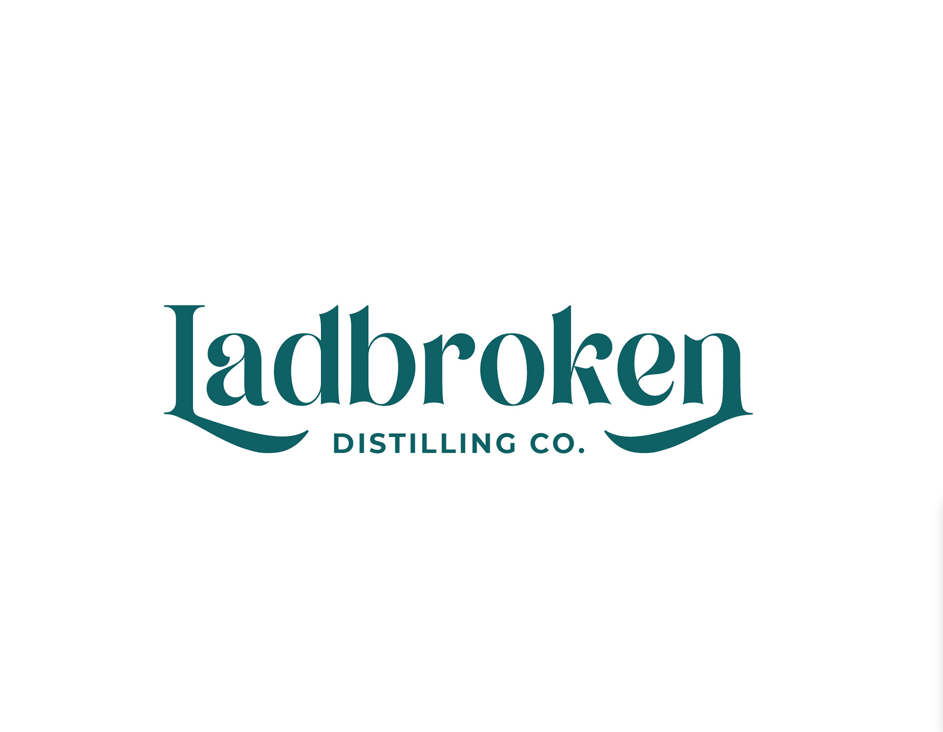
The bottom of the letters represent the hills and valleys around the Distillery
The problem of a horizontal identity can often be maintaining size and legibility in the spaces such as squares and circles. This would be overcome by creating a logo mark which would consist of a LD for Ladbroken Distillery or Just the Letter L
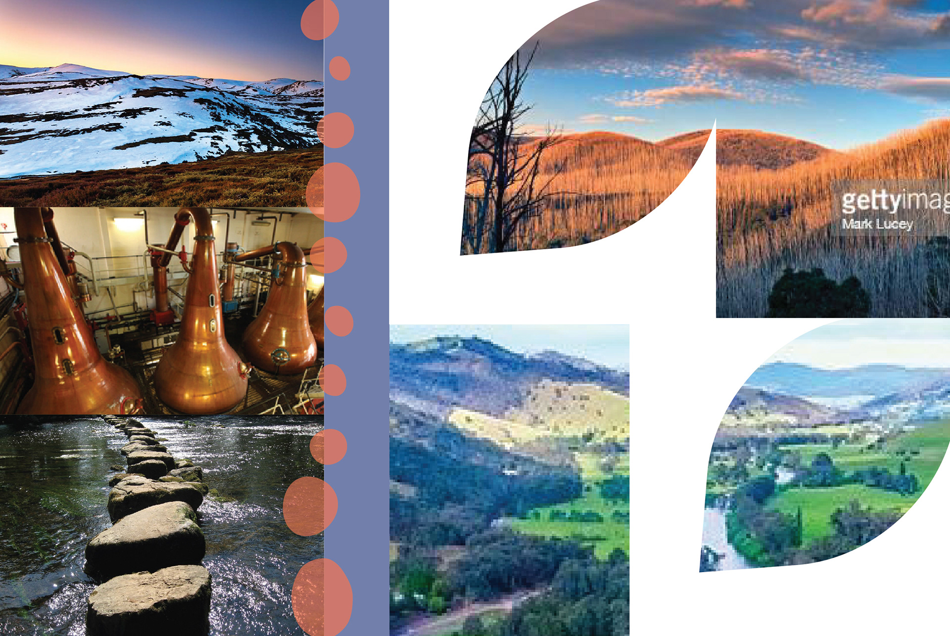
Behind the scenes - variations and exploration
CONCEPTS CONSIDERED

Thank you